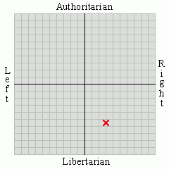
The "plus" sign is supposed to incorporate an "L" for "Lancaster," and it will be a dynamic blue to accent our good air quality, and a green because, well, everyone likes green. Considering the level of readily-apparent corruption on the city council, I think they could have at least got a little more accuracy:


1 comment:
"Positively clear?"
So ... Lancaster is composed of third-level Scientologists with HIV?
Post a Comment